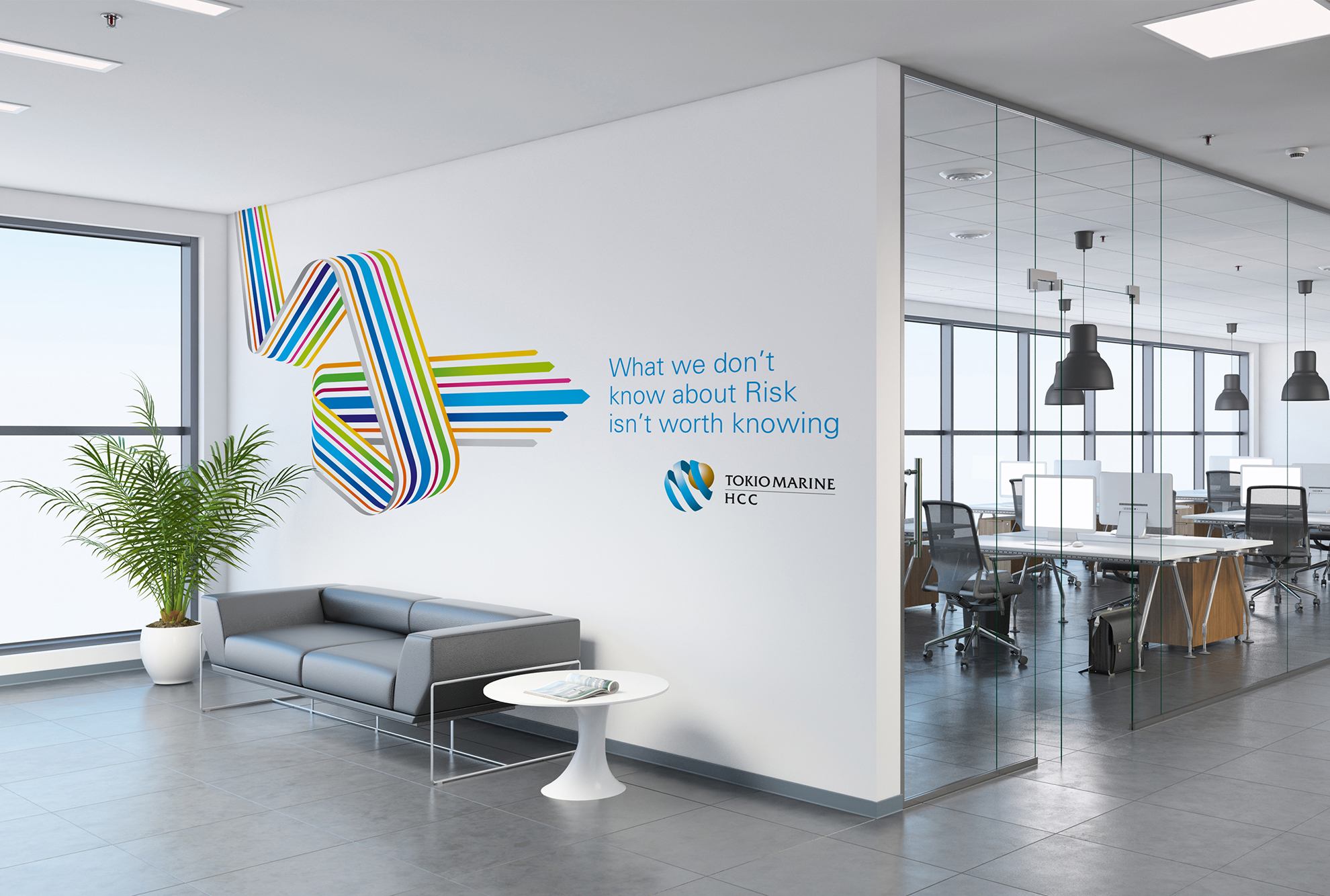
CHALLENGE
Tokio Marine HCC were in need of a brand refresh in late 2019 having had a relatively unchanged identity for several years. A campaign that featured a suite of free-form directional arrows had been well received and we were asked to incorporate these arrows into a keynote presentation and look at ways these arrows could underpin their wider brand identity.

SOLUTION
We proposed that rather than just use the arrows as mere decoration they became a more integral and purposeful element interacting with headline copy and pull-out copy. We also proposed injecting the tone of voice with a bit more attitude and simultaneously substantiating the arrows – the overarching theme became ‘We know our way around Risk.’
RESULTS
We created a graphic language of arrows that was more purposeful, distinctive and flexible and could interact with copy and photography. By summer of 2020 we had created a comprehensive set of guidelines, along with a library of arrows and mission statements, so that their in-house teams could implement the new look globally across multiple touch-points.